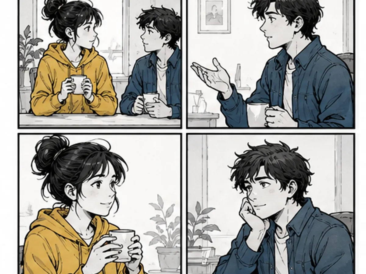
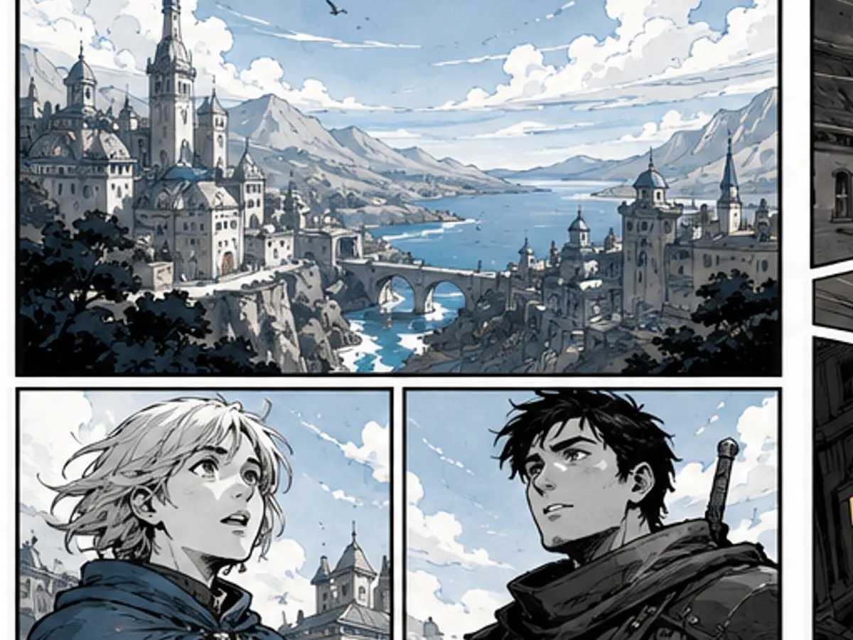
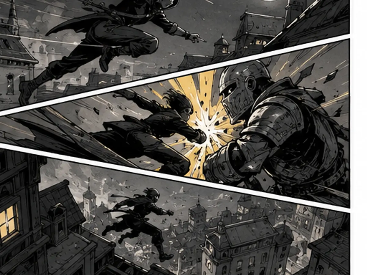
ComicWave keeps the comic panel layout plan, generated panels and lettering as separate stages. You can review the structure before drawing and replace one weak result without discarding accepted work.
Comic panellayouts.
Comic panel layouts control reading order, pace and emphasis. Start with the clearest grid that serves the scene, give important beats more space, keep gutters readable, and test the full page at its final size before adding visual complexity.
Try it here
Fast Comic planning is free — you approve before anything is drawnLayout decisions
- Reading order
- Clear first panel and predictable next step
- Panel size
- More space for importance or duration
- Gutters
- Consistent separation between moments
- Dialogue
- Reserved space along the reading path
- Variation
- Complexity only when the scene earns it
- Proof
- Final-size page and mobile review
Make the order obvious
Readers should find the first panel immediately and predict where to look next. A regular grid is not boring when acting, framing and dialogue do the storytelling.
Place balloons along the same path. If the eye must cross a later panel to reach the next line, change the layout or rewrite the lettering.
Use size and shape
Large panels feel important or long; small panels can feel quick. Wide panels suit settings and horizontal movement, while tall panels emphasise height, distance or a reveal.
Diagonal borders create energy but can confuse the order. Use them for a clear action purpose and surround them with stable anchors.
Proof the final page
Add real dialogue before final art. Lettering changes the balance of a page and reveals whether a composition left enough open space.
View the layout at print size or phone width. Check faces, type size, gutters, page turns and the transition to the next screen or page.
What you get
A simple grid gives the reader confidence and leaves more attention for acting and dialogue.
A wider or taller panel can slow time, reveal a setting or hold a turning point.
Consistent separation tells the reader when one moment ends and the next begins.
A clever layout fails if faces, text or the next panel become hard to find on the real page.
How it works
Write one visible action or reaction for each moment the reader must understand.
Arrange those beats in an obvious order, then enlarge only the moments that need emphasis.
Reserve lettering space, inspect the gutters and read the page at final print or phone size.
Six useful comic layout patterns
Original layout studies made for this guide. Treat them as starting structures and adapt the panel count to the story.
Why creators keep control
See exactly what stays under your control. Customer quotes will appear here only when we have permission to publish them.
The visual examples on this page are original concept illustrations made for this topic. They are not customer work, benchmark results or a promise that every generated output will match them.
How we verified this
Why this beats one big prompt
Questions
Related tools
Same category, the next step in the workflow, and something to read.